.png)
Over the past four Event Data Lab reports, we've analyzed the same dataset of 3,600+ live events from multiple angles: event type, ticket count, custom forms, promo codes, and registration categories. Each report examined a single variable. This synthesis pulls the findings together into a unified framework for how registration friction actually works.
The short version: registration completion is shaped by choice architecture, not by how much information you collect. But the details matter, and some of the most common optimization advice in event tech turns out to be wrong.
What We Studied
Each report isolated a different registration variable and measured its relationship with completion rate (the percentage of users who finished registration out of all who started it). The dataset, methodology, and exclusion criteria were consistent across all four analyses.
Report #01: Event Type. Registration completion rates by event format (association conferences, professional conferences, trade shows). Median completion exceeds 90% for conference-style events. Trade shows are lower (~84%) with greater variability. But within-category variability is wider than between-category differences, meaning flow execution matters more than event type.
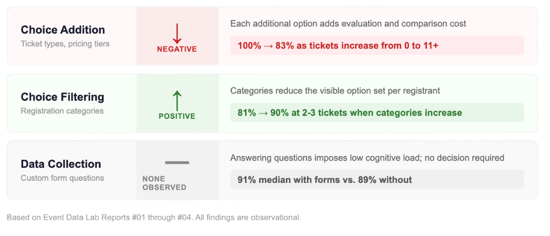
Report #02: Ticket Count. The number of ticket types configured is the strongest observable predictor of completion. Median completion drops from 100% (no ticket selection) to 93% (1 ticket) to 88% (2-3 tickets) to 83% (11+ tickets). The steepest decline occurs between zero and three ticket options.
Report #03: Custom Forms and Promo Codes. Custom registration forms show no negative relationship with completion. Events with 21+ questions complete at higher rates than events with 1-2 questions (likely due to selection effects, not the questions themselves). Promo codes correlate with lower completion, but the gap is explained by event complexity: promo-configured events carry 6x more ticket types.
Report #04: Registration Categories. Categories alone have no effect on completion. But when ticket complexity is present, categories buffer the decline. Events with 2-3 tickets and 4-5 categories complete at ~90%, compared to ~81% for single-category events with the same ticket count.
The Framework: Choice Architecture Drives Registration Friction
Across all four reports, a consistent pattern emerges. Registration features fall into three categories based on their observed relationship with completion:
Features that add choices reduce completion. Ticket types are the clearest example. Each additional ticket option introduces a decision that the registrant must evaluate, compare, and resolve before proceeding. The cost is measurable and monotonic.
Features that add information collection do not reduce completion. Custom form questions, regardless of count, show no negative association with completion. Answering a question is a fundamentally different cognitive task from choosing between options. The data reflects that difference.
Features that filter choices can offset the decline. Registration categories, when combined with ticket complexity, are associated with materially higher completion. The likely mechanism is that categories reduce the visible choice set: registrants see only the tickets relevant to their path, not the full menu.
This framework reframes a common misconception in event registration design. Many teams treat all registration steps as equivalent friction. They shorten forms, remove questions, and simplify categories in the name of "reducing friction." The data suggests this is the wrong target. The friction that matters is decision complexity, not form length.
What This Means for Event Teams
1. Don't optimize the wrong thing
The most common registration optimization advice is to shorten your forms. The data does not support this. Events with long custom forms complete at rates equal to or higher than events without them. If you need attendee data for operational, programming, or compliance purposes, collect it. The completion cost is not measurable in this dataset.
2. Treat ticket selection as the primary friction point
Ticket count is the single strongest predictor of completion that we've observed across four reports. The sharpest drop occurs between one and three ticket options. If your event is in that range, every additional ticket type carries a measurable cost. Before adding a new ticket tier, ask whether the business value justifies the completion trade-off.
3. Organize tickets within categories
This is the most actionable finding in the series. For events that need multiple ticket types, distributing them across registration categories is associated with a 9 percentage point recovery in median completion. Instead of presenting all options in a single view, structure the flow so registrants select their path first, then see only the tickets relevant to them.
4. Know where the buffering effect stops
Category-based organization is most effective at moderate ticket counts (2-5 tickets). At 6+ ticket types, even well-structured categories cannot fully offset the complexity. Events in this range should consider whether ticket consolidation is possible in addition to organizing what remains.
5. Benchmark against your event type, then look inward
Report #01 showed that within-category variability exceeds between-category differences. The largest gains in registration performance come from identifying and addressing outlier behavior, not from optimizing against category medians. If your completion rate is significantly below the benchmarks for your event type, the issue is almost certainly flow-specific.
6. Be skeptical of surface-level correlations
Report #03 demonstrated that promo codes correlate with lower completion, but the relationship is entirely explained by event complexity. Naive benchmarking (comparing events with a feature against events without it) will frequently mislead. Always ask what else differs between the groups before attributing a performance gap to a single variable.
What We Don't Know Yet
Transparency about limitations is a core principle of the Event Data Lab. These four reports do not address several commonly cited friction sources:
Required field count. We analyzed custom form questions but not the number of required fields in the base registration form. This is one of the most frequently cited drivers of abandonment and is a priority for future analysis.
Mobile vs. desktop behavior. Device type is not available in the current dataset. If completion rates differ meaningfully by device, that would change the optimization calculus for form design.
Payment flow friction. We observed that events with more ticket types (which are more likely to involve payment) show lower completion, but we cannot isolate the effect of the payment step itself.
Pricing clarity. How ticket options are described, priced, and compared is not captured in the data. Presentation quality may matter as much as the number of options.
Future Event Data Lab reports will expand into these areas as additional data becomes available, and will also move beyond registration into onsite operations, engagement, and attendee behavior.
Download the Full Report
Download the complete Event Data Lab synthesis
Includes the full framework, all benchmark tables from Reports #01 through #04, a registration optimization checklist, and methodology notes.
This report is part of the Event Data Lab, an ongoing research initiative analyzing real-world event performance across registration, onsite operations, engagement, and ROI.